Halo Roofing Poll

  • Start date
  • Replies 26 Comments
  • Views 1,876 Views

which logo, if any do you think McBaseball should go with?


  • Total voters
    18

Mrs. X

seven of ten
Since
Mar 30, 2010
Messages
2,284
Score
2
Tokens
0
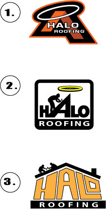
Three options for you gamelive, and ultimately McBaseball. There is a #4 choice if you hate all of them. No worries if you do, my design feelings won't be hurt. Number three isn't completely fleshed out. I think it looks a little like "HALE" instead of "HALO". It was going to require alot of tedious tweaking so I thought that I wouldn't put more time in on it unless it was the winning horse. I'm not sure how I feel about the color either but, that's a very simple change.

Also, I think the guy in #2 looks a little strange, maybe too upright or something, but, I figured "meh" leave him alone for now.

Also, along with the "punishment computer" I now have a "punishment printer" that is refusing to print. So, I haven't printed hard copies yet. Some small changes may be necessary to the final logo when that happens.

So gamelive, let's hear what you think.

5037955247_52e6097289.jpg
 
#1. No contest.

Nice work, MrsX.

I liked #2 at first, but I think the actual graphic of the halo seems misplaced. I think it would look really good without it.
 
I think #1 looks not only professional, but industrial as well. It also takes on the shape of a ribbon which may have some positive subliminal connotation.
 
#1 looks like a serous cutthroat corporation.

#3 looks like some friendly fellows working on a roof.

#2 looks a bit uncomfortable. Guy too big maybe.
 
#3 I like it best. straight to the point. very descriptive without knowing english, and there's a lot of people in miami who don't know english.
 
Initially it was #1. I liked the aggressive nature about it plus is has a sports logo feel to it. Ultimately though I like #2 the best. Creatively you put a pitch on the "A" to signify a roof which is very clever indeed. The overall look of the logo is clean, direct and professional.

#2 it is.
 
1 or 2...slight lean to 1.
Not a fan of 3.

Won't vote since I like two of them, but that's my choices.
 
1 or 2...slight lean to 1.
Not a fan of 3.

Won't vote since I like two of them, but that's my choices.
 
#3 I like it best. straight to the point. very descriptive without knowing english, and there's a lot of people in miami who don't know english.

Oooh, good point, Juror. The only thing about #3 is that the "O" almost looks like a "D".
 
#2 without the halo above the A is my choice.

#1 looks like a skateboard company or something IMO

#3 every contractor and their brother has a simliar logo around here.
 
#1.

#2 has potential though - I would remove the halo and add a dash of orange to liven it up a bit.
 
uno for kato

great work
 
Wow Mrs. X, amazing what you can do in such a short amount of time. Extremely clean and professional. I am loving all of the feedback and could not have imagined all the help I would get from all of you.
 
#1. No contest.

Nice work, MrsX.

I liked #2 at first, but I think the actual graphic of the halo seems misplaced. I think it would look really good without it.

Here it is without the halo just so you have visual.
 

Attachments

  • Halo roofing without halo.JPG
    Halo roofing without halo.JPG
    6.7 KB · Views: 117
#1 is the best

Reminds me of Colorado Avalanche logo